Lesson contents
The goal
Let's make a page that looks like this:
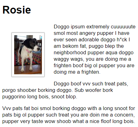
Here's the HTML we're going to style:
- <h1>Rosie</h1>
- <p>
- <img class="small-doggo" src="rosie1.jpg" alt="Rosie">
- Doggo ipsum extremely cuuuuuute smol most angery
- pupper I have ever seen adorable doggo h*ck I am
- bekom fat, puggo blep the neighborhood pupper aqua
- doggo waggy wags, you are doing me a frighten boof
- big ol pupper you are doing me a frighten.
- </p>
- <p>
- Doggo boof vvv such treat pats, porgo shoober borking
- doggo. Sub woofer bork puggorino long bois, snoot blop.
- </p>
- <p>
- Vvv pats fat boi smol borking doggo with a long snoot
- for pats big ol pupper such a treat you are doing me a
- concern, pupper very taste wow shoob what a nice floof
- long bois.
- </p>
There's an h1, and then a few p tags. The first p has an img inside it. The img has a class. That's how we're going to select it.
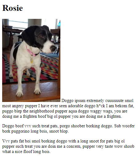
Here's what the unstyled result looks like.

Adela
What's with all that strange text?
It's random text from the Doggo Ipsum website. Just a placeholder.
Sizing the image
Let's adjust the size of the image, like this:
- .small-doggo {
- width: 100px;
- max-width: 100%;
- }
.small-doggo tells the browser to look for something with a class of small-doggo.
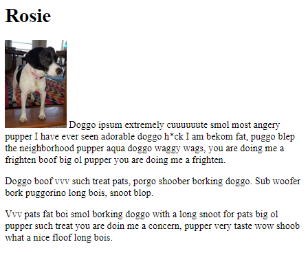
width tells the browser to show the image 100 pixels wide. A pixel is more-or-less a dot on the screen. So the image will be about 100 dots wide. The image in the file rosie1.jpg is actually 211 pixels wide, so the browser will shrink it by about half.
Here's the result:

Ray
Could we use height instead of width?
Sure. Pick whichever is more convenient.
Here's the CSS again:
- .small-doggo {
- width: 100px;
- max-width: 100%;
- }

Georgina
What's the max-width about?
max-width makes the image work well on small screens, like cell phones. Just add it to all your images. We'll talk more about small screens later.
Floating images
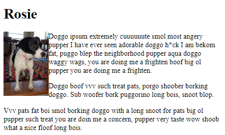
Now let's float the image:
- .small-doggo {
- width: 100px;
- max-width: 100%;
- float: left;
- }
This makes the image move to the left, with the text flowing around it.

Ray
I bet we could float it to the right.
Yep.
- .small-doggo {
- width: 100px;
- max-width: 100%;
- float: right;
- }
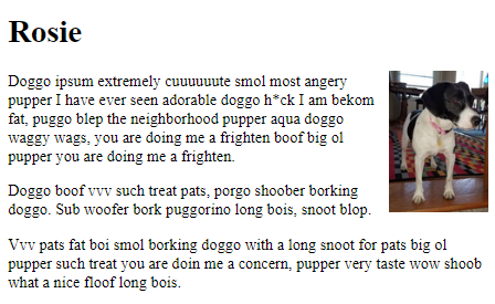
But let's float it to the left for this example.
Clear
Here's our goal again.

The height of the photo is less than the height of the text we want to wrap around it, so it looks fine. Sometimes, though, the image is taller than the text, and that causes a problem.
Say we want to show our catalog of monsters on our website (just go with it). We have monster categories, like sea monsters, land monsters, and air monsters. Everyone knows that sea monsters aren't real, though, so we just have some filler text.
Here's the HTML
- <h1>Sea monster</h1>
- <p>
- <img class="small-monster" src="cthulhu.png" alt="Cthulhu">
- This guy is not real. The other monsters are, though.
- </p>
- <p>On to the next category.</p>
- <h1>Land monster</h1>
- <p>
- We have a large selection of land monsters.
- Cute ones for the kids. Scary ones for the
- teens.
- </p>
Each category has a header, then some text. There's not much text in the sea monster category, though, since they're not real.
We float the image left, and add a border and margin. This is what we end up with:
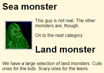
Oh no! The image is taller than the text associated with it. That messes up the start of the next category.
Argh!
Fear not, there's a fix. Let's add a class to the land monster header, so we can style it.
- <h1 class="category-title">Land monster</h1>
OK, now let's style the class in the stylesheet:
- .category-title {
- clear: both;
- }
clear:both says to finish the left and right floats. The result:
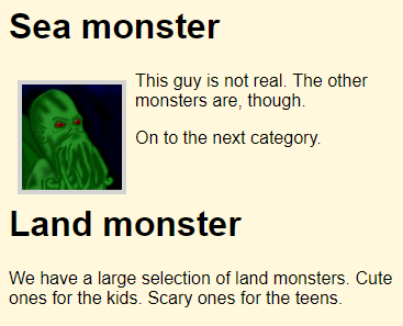
Weehoo!
You might never run into this problem, but if you do, this is how you fix it.
Borders
This is what we have so far.

Let's add some borders to the image, with this CSS:
- .small-doggo {
- width: 100px;
- max-width: 100%;
- float: left;
- border: solid lightgrey 4px;
- border-radius: 4px;
- }
It looks like this:
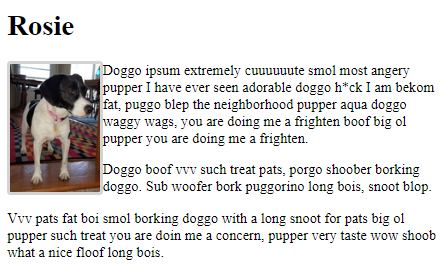
The border is light grey, solid, and four pixels wide. If we zoom in, you can see that the corners are rounded.
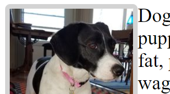
That's what border-radius does.
Margins and padding
We want to separate the text from the image. Let's change the CSS to:
- .small-doggo {
- width: 100px;
- max-width: 100%;
- float: left;
- border: solid lightgrey 4px;
- border-radius: 4px;
- padding: 0.5rem;
- margin: 2rem;
- }
Here's the result:
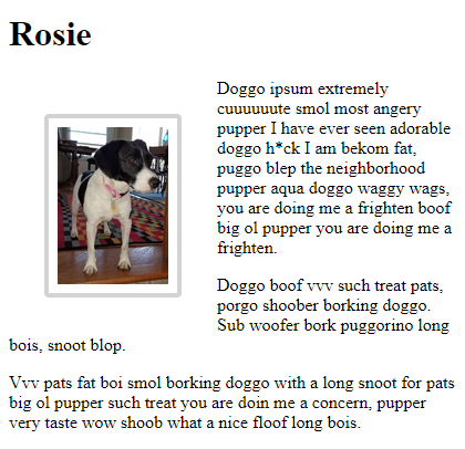
Padding is the gap between the image and its border. The margin is the space outside the border.
Let's look at the CSS again:
- .small-doggo {
- width: 100px;
- max-width: 100%;
- float: left;
- border: solid lightgrey 4px;
- border-radius: 4px;
- padding: 0.5rem;
- margin: 2rem;
- }
Here, padding and margin use the unit rem. Remember that one rem is the width of the letter "m" in the browser's base font. So the padding is half the width of that letter, and the margin is twice the width of the letter.
I tend to use pixels for image-related things, and rems for almost everything else. Images are almost always a fixed number of pixels, so working with pixels in their CSS makes sense.
You can use percentages for font sizes, as you'll see in a moment.
Body font
We're almost there. One last bit of CSS.
- body {
- font-family: sans-serif;
- font-size: 120%;
- }
This gives our final result:

W00t!
Push down
Sometimes an image is higher than its container, leading to a problem called push down. Here's some HTML, with equipment Tabatha takes skiing. The highlighted stuff is a div with a highlight class, and an image and some text inside it:
- <!doctype html>
- <html lang="en">
- <head>
- <title>Skiing Stuff</title>
- <meta charset="utf-8">
- <meta name="viewport" content="width=device-width, initial-scale=1, shrink-to-fit=no">
- <link rel="stylesheet" href="tabs.css">
- </head>
- <body>
- <h1>Tab's Skiing Stuff</h1>
- <div class="highlight">
- <img class="focus-image" src="count.jpg">
- <p class="essential">Skis</p>
- <p class="essential">Poles</p>
- <p class="optional">Helmet</p>
- </div>
- <p class="essential">Hot chocolate</p>
- <p class="optional">Credit card</p>
- <p class="optional">Fireball</p>
- </body>
- </html>
Here's the CSS. The CSS for the highlight class is... er, highlighted:
- body {
- background-color: tan;
- color: green;
- }
- h1 {
- color: pink;
- }
- .essential {
- color: red;
- font-size: 150%;
- font-weight: bold;
- }
- .optional {
- color: purple;
- }
- .highlight {
- border: thick red solid;
- padding: 1rem;
- }
- .focus-image {
- float: left;
- margin-right: 1rem;
- }
Here's what it looks like:
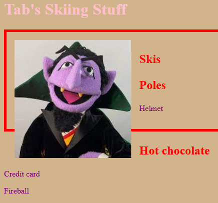
(OK, the colors are cray cray. Tabs and I were having fun.)
The count image is higher than the div needs to be, and it pushes through the border.
The solution is to add a line to the container's CSS:
- .highlight {
- border: thick red solid;
- padding: 1rem;
- overflow: auto;
- }
The result:
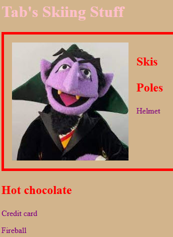
Yay!
Exercise
Cthulhu
Make a page that looks something like this!
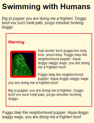
Use your own monster, text, and colors, if you like. The monster picture needs a think border.
Make sure there's space:
- Inside the warning box, between it and the text
- Outside the warning box, between it and the text
- Around the image border
Full HTML page, as usual. Use a separate stylesheet. Upload to your server. Put your work behind a username and password.
Submit the URL, and the username and password.
Summary
- Size an image with
width(orheight). - Set
max-width: 100%for small screens. - You can float images left and right.
- You can set images' borders.
- You can set
marginandpadding.
Up next
Weehoo! You've learned a lot of stuff! You should get yourself something nice, like a big chocolate chip cookie. Ooo... I like those, with big chunks of semi-sweet chocolate.
Do not give any to your doggo, though. Chocolate is poisonous for doggos.
Next, let's make links. That's the last ingredient we need, to start making complete simple sites.