Not graded. So why do it?
Log in
If you're a student, please log in, so you can get the most from this page.
Lesson contents
What is a navbar?
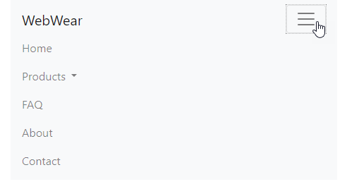
A navbar is a menu-looking thing, like this (click on the down arrow):
In BS, the navbar can include branding, to make an entire header. "Branding" identifies the website. Just the word "DoggoLand" in this case, but you can add a logo.
If you view the menu on a phone, the browser will collapse the menu under a hamburger icon:
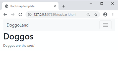
BS magic at work.
Simple navbar
Let's start with something simple for now. We'll make the navbar above, without the dropdown:
First, we need a place for the navbar to live on the page. Let's give the navbar a row in the layout.
- <!-- Navbar -->
- <div class="row">
- <div class="col">
- ...
- </div>
- </div>
- <!-- Content -->
- <div class="row">
- <div class="col">
- ...
- </div>
- </div>
Now let's copy the navbar sample from the BS website. There's a lot of code! Don't worry about it. You don't need to sweat the deets. Not much, anyway. I'll show you what parts you need to think about.
I ended up with:
- <nav class="navbar navbar-expand-lg bg-light">
- <div class="container-fluid">
- <a class="navbar-brand" href="#">DoggoLand</a>
- <button class="navbar-toggler" type="button" data-bs-toggle="collapse" data-bs-target="#navbarNav" aria-controls="navbarNav" aria-expanded="false" aria-label="Toggle navigation">
- <span class="navbar-toggler-icon"></span>
- </button>
- <div class="collapse navbar-collapse" id="navbarNav">
- <ul class="navbar-nav">
- <li class="nav-item">
- <a class="nav-link" href="#">Rides</a>
- </li>
- <li class="nav-item">
- <a class="nav-link" href="#">Tickets</a>
- </li>
- <li class="nav-item">
- <a class="nav-link" href="#">Location</a>
- </li>
- </ul>
- </div>
- </div>
- </nav>
Lines 1, 2, 20, and 21 wrap the navbar.
Line 3 makes the branding. This thing:


Marcus
How would I add a logo?
Add an img tag on line 3:
- <nav class="navbar navbar-expand-lg bg-light">
- <div class="container-fluid">
- <a class="navbar-brand" href="#"<img src="..." alt="Logo">DoggoLand</a>
Lines 4-6 make the dropdown button, that shows up on small screens:
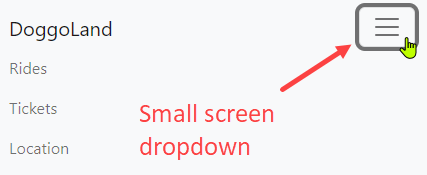
Here's the code again:
- <nav class="navbar navbar-expand-lg bg-light">
- <div class="container-fluid">
- <a class="navbar-brand" href="#">DoggoLand</a>
- <button class="navbar-toggler" type="button" data-bs-toggle="collapse" data-bs-target="#navbarNav" aria-controls="navbarNav" aria-expanded="false" aria-label="Toggle navigation">
- <span class="navbar-toggler-icon"></span>
- </button>
- <div class="collapse navbar-collapse" id="navbarNav">
- <ul class="navbar-nav">
- <li class="nav-item">
- <a class="nav-link" href="#">Rides</a>
- </li>
- <li class="nav-item">
- <a class="nav-link" href="#">Tickets</a>
- </li>
- <li class="nav-item">
- <a class="nav-link" href="#">Location</a>
- </li>
- </ul>
- </div>
- </div>
- </nav>
Lines 7–19 are the menu options. Replace the # with URLs.
Line 7 is:
- <div class="collapse navbar-collapse" id="navbarNav">
The id has to match line 4:
- <button ... data-bs-target="#navbarNav" aria-controls="navbarNav" ...

Georgina
Would we need to change it at all? Can we just leave it at navbarNav?
You only have to change it if you have more than one navbar on the page. If you don't, you shouldn't need to change it.
The active link
Look in code on the BS site, and you'll see an active class, and an aria-current property:
- <a class="nav-link active" aria-current="page" href="#">Home</a>
They help users see which page in the menu is the current page.
- If they're looking at the home page, the Home link should have the
activeclass. - If they're on the blog page, the Blog link should have the
activeclass. - If they're on the FAQ page, the FAQ link should have the
activeclass.
The active class adds some special styling, to make the link look a little different.
Using them requires server-side programming. We won't be doing that in this course. You can remove them, to get:
- <a class="nav-link" href="#">Home</a>
Adding links
You can add as many links as you like to the menu.
- <li class="nav-item">
- <a class="nav-link" href="puppers.html">Puppers</a>
- </li>
- <li class="nav-item">
- <a class="nav-link" href="doggos.html">Doggos</a>
- </li>
- <li class="nav-item">
- <a class="nav-link" href="llamas.html">Llamas</a>
- </li>
Too many links gets confusing for users. Try to keep to a maximum of around seven.
Changing the look and feel
There are some options you can use to change how the navbar looks. For example, you can change the menu's color from light to dark. This is from the official navbar page:
- <nav class="navbar navbar-dark bg-dark">
- <!-- Navbar content -->
- </nav>
You can set your own background color with a mix-in:
- <nav class="navbar navbar-light navbar-custom">
- <!-- Navbar content -->
- </nav>
navbar-custom isn't in BS. Your CSS might have this rule:
- .navbar-custom {
- background-color: #e3f2fd;
- }
Another fun thing you can do is make the navbar stick to the top of the page. fixed-top is the class you want.
- <nav class="navbar fixed-top navbar-light bg-light">
- ...
- </nav>
There's much more you can do. See the official navbar docs
Video lesson
How to make a simple navbar.
Nested menu items
You can add a dropdown menu, like the Rides in this navbar:
How do you make it? Here's code for a regular menu item, from before:
- <li class="nav-item">
- <a class="nav-link" href="llamas.html">Llamas</a>
- </li>
Replace it with code that includes a dropdown.
- <li class="nav-item dropdown">
- <a class="nav-link dropdown-toggle" title="Get your thrill on!" role="button" data-bs-toggle="dropdown" aria-expanded="false" href="#">
- Rides
- </a>
- <div class="dropdown-menu">
- <a class="dropdown-item" href="URL HERE" title="Spinning fun!" >Doggotron</a>
- <a class="dropdown-item" href="URL HERE" title="I'll be bark" >Doggolator</a>
- <a class="dropdown-item" href="URL HERE" title="A bazillion happy doggos">Dogarium</a>
- </div>
- </li>
The li tag contains the dropdown. It has an a tag for the top menu item, and a div with an a for each link.
Responsive breakpoints
When the browser window gets small, navbars collapse vertically, under a hamburger icon:

That's good, but you need to think about how small the window should get before the navbar collapses.
These videos show the issue. When the navbar breakpoint is too narrow:
When the navbar breakpoint is too wide:
When the navbar breakpoint is just right:
The differences between these navbars is just one class, added to the nav tag. This is the version that's too narrow:
- <nav class="navbar navbar-light bg-light navbar-expand-sm">
The navbar is in its regular horizontal view for small windows and up. But the menu is too wide for small windows, so it gets jumbled.
This is the version that's too wide:
- <nav class="navbar navbar-light bg-light navbar-expand-lg">
The navbar is in its regular horizontal view for large windows and up. For medium-sized windows, the menu is in its vertical form. But medium windows can fit the horizontal form easily.
This is the version that's just right:
- <nav class="navbar navbar-light bg-light navbar-expand-md">
The menu is in vertical hamburger form for extra small and small windows. For medium windows and up, the menu is in its regular horizontal form. That gives the best user experience.

Adela
We should always use navbar-expand-md?
No, it depends on your menu's width. You need to experiment. Try different classes, and see which one works best for your site. Here are the classes you can use:
navbar-expand: Never collapses vertically, stays horizontal (only use for very small menus)navbar-expand-sm: Collapses belowsmwidths, < 576pxnavbar-expand-md: Collapses belowmdwidths, < 768pxnavbar-expand-lg: Collapses belowlgwidths, < 992pxnavbar-expand-xl: Collapses belowxlwidths, < 1200pxnavbar-expand-xxl: Collapses belowxxlwidths, < 1400px
Usually, you'll use either navbar-expand-sm or navbar-expand-md, depending on the width of your menu.
Accessibility
Part of a11y is that the navbar should be usable with just the keyboard. You can try it out on the page you're looking at now. Click in your browser's address bar. Now press Tab, and the browser will select a link each time you do. The selected link is said to have the focus. The focus will march across the navbar.
When the top entry in a dropdown has the focus, press the down arrow. The menu expands.
Styling
Check out this navbar:
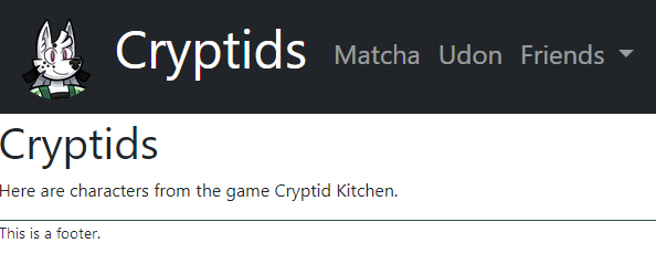
It has a dark background, and the text is bigger. You can try it yourself.
Here's what the nav tag looks like:
- <nav class="navbar navbar-expand-lg navbar-dark bg-dark">
The new classes at the end give it a dark look.
Here's the navbar branding stuff:
- <a class="navbar-brand" href="index.html">
- <img src="images/matcha-logo.png" class="logo rounded-circle" alt="Logo">
- Cryptids
- </a>
logo is defined in a custom CSS file. I named the file custom-styles.css, and put it in a folder called stylesheets. Here's the code that linked the stylesheet into the pages:
- <link rel="stylesheet" href="stylesheets/custom-styles.css">
Notice the folder name in the href.
Here are the contents of the CSS file:
- .navbar a {
- font-size: 1.5rem;
- }
- .navbar .navbar-brand {
- font-size: 3rem;
- }
- .cryptid-footer {
- border-top: solid thin darkslategrey;
- }
- .logo {
- width: 80px;
- }
The logo class changes the size of the logo image. Changing the width also changes the height.
The first two classes change the size of the text in the navbar. .navbar a changes the a tags inside the navbar, and only those. Other a tags on the page are not affected.
.navbar .navbar-brand tells the browser: "Look inside tags with the class navbar, for tags with the class navbar-brand. Make their text 3rem high.
You can look at the HTML code in the example. Remember, right-click on the page, and choose View page source to see the HTML that makes the page.
Exercise
Next up
Let's see how you can make one navbar, and reuse it across your entire site. A big productivity win.


