Lesson contents
Making pages responsive is more complex than anything we've done before. You can learn it, but we have to take it slowly.
This lesson is about the basic principles of BS's responsive grid system. We won't be doing realistic tasks in this lesson, just tasks that show the responsive grid system in action.
In the next lesson, we'll use the principles you learn here on real layouts.
The problem
You want your site that looks good on a desktop, and on mobile devices, like tablets and phones. You have two choices:
- Make two different sites.
- Make one site that adjusts to screen size.
The smart money is usually on the second one. It's cheaper to create and maintain one site than two.
BS helps you make responsive sites, that is, sites that adapt to different screen sizes. This lesson is about how you do that.
Your browser can mimic devices
Desktop browsers can mimic mobile devices, so you can see what your site looks like on smaller screens. Here's the toggle-device-toolbar button on Chrome's dev tools:
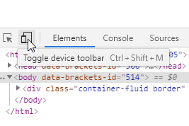
The toolbar shows at the top.
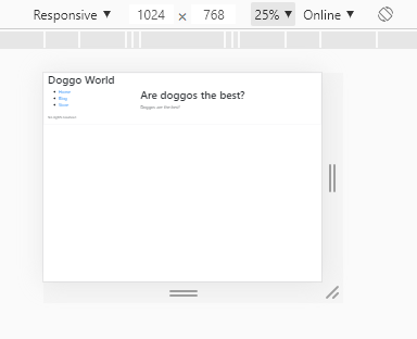
Use the left dropdown to choose a device. For example:
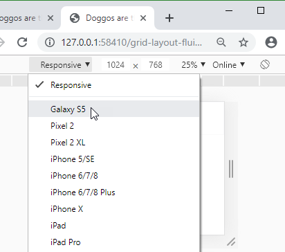
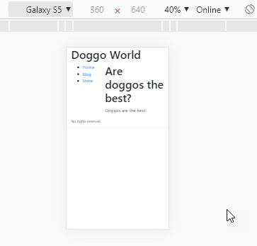
Then you can see what the page looks like on that device:

Ray
That's so cool!
Isn't it?
You can change the zoom factor as well:
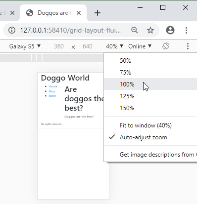
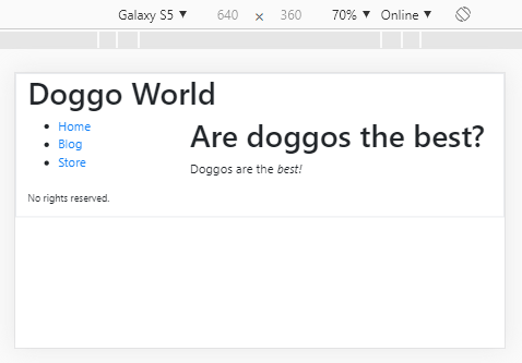
Now let's see what would happen if you rotate the phone. There's a button for that:

Here's what it looks like in landscape:

Georgina
That list of phones you had.
This one?


Georgina
What if you want to use a phone that's not on that list?
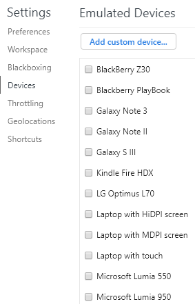
No problem. There's an edit button at the end of that list. Click, and see a long list of devices you can choose:

Marcus
Wow! Blackberries, and Windows phones.
Right. And tablets, laptops, you name it. You can add other devices, too. Like, I dunno, a browser on a t-shirt.

Adela
Does that really exist?
Not as far as I know, but it's only a matter of time.
Exercise
Page on an iPad
Make a screen shot, showing what this sample page would look like on an iPad.
Include something showing what device your browser is simulating, like Chrome's device toolbar. For example, here's a screen shot showing the device being simulated.

(Your screen shot will be of a different page, on a different device.)
Use whatever zoom you want, but 40% is good.
Hint: it's easy with Chrome.
Upload the screen shot.
The BS device breakpoints
OK, so how does BS let you make a site that adjusts to screen sizes?
First, you need to know about breakpoints. In CSS, there are things called media queries, that let you apply different style rules to different screen sizes. For example, this code sets page background color, depending on screen size (or browser window size):
- /* Set base background color */
- body {
- background-color: white;
- }
- /* For screens that are 900px or less, set the color to antiquewhite */
- @media screen and (max-width: 900px) {
- body {
- background-color: antiquewhite;
- }
- }
- /* For screens that are 500px or less, set the color to lightyellow */
- @media screen and (max-width: 500px) {
- body {
- background-color: lightyellow;
- }
- }
You can try it. Resize the browser window, and watch what happens.
(OK, it's not useful. It's just to show media queries at work.)
This example doesn't use Bootstrap, just media queries created manually. You won't be writing media queries yourself. You'll take advantage of media queries that are already in BS's stylesheet.
BS breakpoints
Here's one of those media queries again:
- @media screen and (max-width: 900px) {
- body {
- background-color: antiquewhite;
- }
- }
That 900px is a breakpoint. BS sets some sensible breakpoints in its stylesheet, that work well with different kinds of devices. Here they are.
| Name | Size | Class prefix |
|---|---|---|
| Extra small | < 576px | col- |
| Small | >=576 px | col-sm- |
| Medium | >=768 px | col-md- |
| Large | >=992 px | col-lg- |
| Extra large | >=1200 px | col-xl- |
| Extra extra large | >=1400 px | col-xxl- |
(">=" means "greater than or equal to.")
We'll get to the class prefixes later.
When you're working with BS, you don't worry about exact display sizes. You work with small, medium, etc. BS takes care of the deets.
On a phone, a web browser usually takes up the whole screen. So, the screen size and the browser window size are the same.
On a desktop PC, you might have several windows open, with a browser taking just part of the screen. The browser window size is smaller than the screen size.
The breakpoints are really talking about browser window size, not screen size. So, make a browser window small on a desktop, and the browser will show you what the website looks like on a screen of that size.
But how do you get different layouts on different displays? Let's check out some examples.
Two-column page
Say we want a page that has two side-by-side columns on most screens:

But on an extra small screen, like a phone, we the columns to stack up, like this:

Remember, this is the same page. We want to write one HMTL file, that adapts itself to browser window size. Making one file is cheaper and easier than making two.
You can try this example. Make the browser window smaller and larger, and watch the magic.
Here's the code for that page, just the body:
- <body>
- <div class="container">
- <div class="row">
- <div class="col-xs-12 col-sm-6 border h4"><strong>Column 1</strong></div>
- <div class="col-xs-12 col-sm-6 border h4"><em>Column 2</em></div>
- </div>
- </div>
- </body>
The border and h4 class just make the text and columns easier to see. Let's get rid of them and some other things, so we can focus on the important stuff:
- <div class="col-xs-12 col-sm-6">Column 1</div>
- <div class="col-xs-12 col-sm-6">Column 2</div>
Remember that there are 12 grid columns in BS.

No matter how big the browser window, there are always 12 columns. On a smaller window, the columns are narrow, maybe 80px on a wider screen, and 40px on a narrower one.
Now, when the window is extra small (less than 576px), the browser applies classes starting with col-xs-, and ignores other col- classes.
When the window is small (more than 576px but less than 768px), the browser applies classes starting with col-sm-, and ignores the other col- classes.
Here's that window size table again.
| Name | Size | Class prefix |
|---|---|---|
| Extra small | < 576px | col-xs- |
| Small | >=576 px | col-sm- |
| Medium | >=768 px | col-md- |
| Large | >=992 px | col-lg- |
| Extra large | >=1200 px | col-xl- |
| Extra extra large | >=1400 px | col-xxl- |
The class prefix is what you use in class names for divs.
So, for...
- <div class="col-xs-12 col-sm-6">Column 1</div>
- <div class="col-xs-12 col-sm-6">Column 2</div>
... when the window is extra small, the browser uses col-xs-12 for both divs. When the window is in the small range, the browser uses col-sm-6 for both divs.
There are 12 grid columns, so when each div has six of them, that's half the container width for each one. The divs end up side-by-side:

When the window is in the extra small range, the browser uses col-xs-12 for both divs. Each column takes the entire container width.
The divs are in the same row:
- <div class="row">
- <div class="col-xs-12 col-sm-6">Column 1</div>
- <div class="col-xs-12 col-sm-6">Column 2</div>
- </div>
When one row has more than 12 grid columns, BS wraps them onto the next line. That's what makes this whole responsive thing work. The first div takes 12 grid columns (the entire container width). The browser runs out of space, so it goes to the next line. The second grid then takes 12 columns.
We get:

That's what we want. Columns either side by side, or, on extra small screens, stacked.
You should try it. Change the window size, and see what happens. Check out what the page looks like on different devices.
Larger windows
Here's the code again.
- <div class="row">
- <div class="col-xs-12 col-sm-6">Column 1</div>
- <div class="col-xs-12 col-sm-6">Column 2</div>
- </div>
It has classes for extra small, and small windows. What about larger windows?
When the window is larger than any of those given in the list of classes (like medium, large, or extra large), the browser uses the largest one that has been given.

Ray
Huh? I don't get it.
Both of these divs...
- <div class="col-xs-12 col-sm-6">Column 1</div>
- <div class="col-xs-12 col-sm-6">Column 2</div>
... have classes for extra small and small windows. If the window is in the medium range, the browser will use the biggest class it's given, that is, the small class. If the window is extra large, the browser will use the biggest class it's given, that is, the small class.
Suppose we change it to this...
- <div class="col-xs-12 col-sm-6 col-md-3">Column 1</div>
- <div class="col-xs-12 col-sm-6 col-md-3">Column 2</div>
On an extra small window, each div would have 12 grid columns. On a small window, each div would have six columns. A medium window or larger, each div would have three columns.
Exercise
Four dogs
Make one HTML page showing four dog photos. How they're arranged depends on the window size. For large and extra large, all four are on one row.

For a small or medium window, there are two dogs per row.

For an extra small window, there is one dog per row.

You can use these photos:


Use at most three col_ classes for each column, like this:
- <div class="col-?? col-?? col-??">
This might be useful:
- <img class="m-1 p-1 border" src="dog1.jpg" alt="Doggo">
Submit your URL, as usual.
Up next
You've learned the principles of the responsive grid system, but how do you use it for real sites, like your final project? That's up next.