Not graded. So why do it?
Not graded. So why do it?
Lesson contents
Bootstrap does many things for us. One is that it gives basic HTML tags a standard, professional look.
What tags look like in BS
BS makes every HTML tag look good, without your adding any classes. Here's some code:
- <h1>h1 here</h1>
- <h2>h2 here</h2>
- <p>I'm a paragraph.</p>
- <ul>
- <li>Unordered</li>
- <li>List</li>
- </ul>
- <ol>
- <li>Ordered</li>
- <li>List</li>
- </ol>
- <p>Here is a link to <a href="borderlands.com">Borderlands</a>.</p>
- <p>Here's Moze from Borderlands 3.</p>
- <p>
- <img src="moze.png" alt="Moze">
- </p>
- <p>One of Kieran's fave games.</p>
Basic stuff, no CSS classes added. Here's what it looks like:
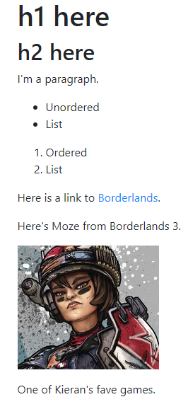
The page looks pretty good, without doing anything special. You can check it out.
This is how you'll use Bootstrap most of the time. Just type your stuff as normal, and let Bootstrap style it.
Basic styles
Bootstrap has basic CSS classes that do Nice Things. Let's check out a few. The deets are in the official docs.
Typography
Typography has to do with fonts. BS has a bunch o' typography classes.
Make a paragraph stand out by adding .lead.
- <p class="lead">
- Renata is a mellow doggo.
- </p>
It looks like:
Renata is a mellow doggo.
Here's a cool one for abbreviations.
- <p>
- Learn <abbr title="HyperText Markup Language" class="initialism">HTML</abbr> for a better life.
- </p>
Here's what it looks like. Hover your mouse over "HTML".
Learn HTML for a better life.
Another one, to center text:
- <p class="text-center">
- Moze has a great big bear.
- </p>
Moze has a great big bear.
Colors
BS gives you classes that let you use colors consistently across your site. For example:
- <p class="text-success">
- You won!
- </p>
You won!
- <p class="text-danger">
- Danger! Sloths approaching! Slowly.
- </p>
Danger! Sloths approaching! Slowly.
Check the docs for more.
Here's what the text-primary does to color.
- <p>
- This is the <span class="text-primary">text-primary</span> class.
- </p>
This is the text-primary class.
What the problem with the text-primary class?
Adela
It's blue. Links are blue. The user would expect to be able to click on blue things.
Right. It's a bad idea to use blue for text that isn't clickable.
Borders
You can add borders to just about anything.
- <p class="border">
- Doggos are the best animals.
- </p>
Doggos are the best animals.
It needs some padding, but we'll fix that later. Remember that padding is the space between the border and the text.
You can put borders around divs. That's good for grouping content:
- <div class="border">
- <p>Reasons to love doggos.</p>
- <ul>
- <li>Always glad to see you</li>
- <li>Fun to play with</li>
- <li>Cuddly</li>
- <li>Happy</li>
- </ul>
- <p>And many more!</p>
- </div>
Reasons to love doggos.
- Always glad to see you
- Fun to play with
- Cuddly
- Happy
And many more!
You can add rounding to the border corners.
- <p class="border rounded">
- Rounded border.
- </p>
Rounded border.
Spacing
You can add margins and padding easily. Check out a border example again:
- <p class="border">
- Doggos are the best animals.
- </p>
Doggos are the best animals.
That's OK, but I'd like to add some padding. I could do this:
- <p class="border p-1">
- Doggos are the best animals.
- </p>
Doggos are the best animals.
For more padding, increase the number after the p-:
- <p class="border p-3">
- Doggos are the best animals.
- </p>
Doggos are the best animals.
Cool, no?
Margins, the same thing. Remember that margins are outside the borders.
- <p class="border p-2 m-4">
- Doggos are the best animals.
- </p>
Doggos are the best animals.
Change the number after the m- to change the border size.
You can set spacing for individual sides, too. For example, me-2 sets the right margin. mt-4 sets the top margin to be twice as large.
Take a look at the docs on spacing for the deets.

Adela
Wait. me-2 sets the right margin? Should that be mr-2?
You would think so. In fact, that's what BS used up to the latest version. But mr- (right) is now me-, and ml- (left) is now ms-.
This has to do with right-to-left languages, like Arabic. For English, we read from left-to-right, so left is the start of the line (ms-), and right is end (me-). For Arabic, ms-, the start of the line, is on the right. me-, the end of the line, is on the left.
It takes a bit of getting used to. We'll only use English in this course.
Rounded borders work better with spacing. Here's a rounded border that looks pretty good.
- <p class="border rounded p-2 m-3">
- Rounded border.
- </p>
Rounded border.
For really rounded:
- <p class="border rounded-pill p-4 m-3">
- Really rounded border.
- </p>
Really rounded border.
Mess with the rounded-pill class. You'll be glad you did.
Tables
Just add the table class to the table tag, and get Nice Things.
- <table class="table">
- <thead>
- <tr>
- <th>Dog</th>
- <th>Weight (kg)</th>
- <th>Happiness (1-10)</th>
- </tr>
- </thead>
- <tbody>
- <tr>
- <td>Oscar</td>
- <td>40</td>
- <td>10</td>
- </tr>
- <tr>
- <td>Renata</td>
- <td>14</td>
- <td>9</td>
- </tr>
- <tr>
- <td>Rosie</td>
- <td>3</td>
- <td>10</td>
- </tr>
- </tbody>
- </table>
| Dog | Weight (kg) | Happiness (1-10) |
|---|---|---|
| Oscar | 40 | 10 |
| Renata | 14 | 9 |
| Rosie | 3 | 10 |
Add another class to add zebra-striping, like this:
- <table class="table table-striped">
- <thead>
- <tr>
- <th>Dog</th>
- <th>Weight (kg)</th>
- <th>Happiness (1-10)</th>
- </tr>
- </thead>
- <tbody>
- <tr>
- <td>Oscar</td>
- <td>40</td>
- <td>10</td>
- </tr>
- <tr>
- <td>Renata</td>
- <td>14</td>
- <td>9</td>
- </tr>
- <tr>
- <td>Rosie</td>
- <td>3</td>
- <td>10</td>
- </tr>
- </tbody>
- </table>
| Dog | Weight (kg) | Happiness (1-10) |
|---|---|---|
| Oscar | 40 | 10 |
| Renata | 14 | 9 |
| Rosie | 3 | 10 |
Check the docs for more awesome table stuff.
Images
You can do all sorts of things with images. Like this:
- <img class="rounded border float-end p-1" src="http://webexamples.skilling.us/professional-sites/bootstrap-styles/moze.png" alt="Moze">
Note
Remember, -end means to the right for English. -start means to the left.
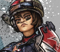
The p-1 added padding, so you could see the border.
Sometimes text gets too close to floated images. Check this out:
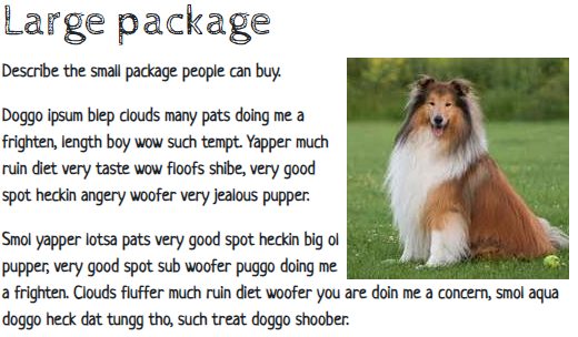
The text seems a little too close to the image. This is better:
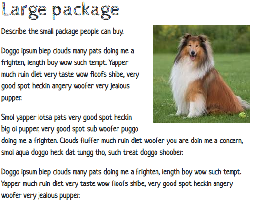
How to do that? Here's the code.
- <img class="float-end ms-4 mb-4" src="../images/dog4.jpg" alt="Doggo">
In the classes, ms means margin start (start is left). mb means margin bottom. Why 4? Just because. Play around until you get something you like. There's a formula for what the 4 means, but I find it easier just to mess around.
Remember we talked clearing floats? That's when you want content to start below something that's floated. BS has a clearfix class for that:
- <p class="clearfix">The <code>p-1</code> added padding, so you could see the border.</p>
The class is on the last element that respects the float. You might never need it, but clearfix is there if you do. Sometimes I have to play around, adding it to different elements, to make it work.
Here's a cool one:
- <img class="rounded-circle" src="http://webexamples.skilling.us/professional-sites/bootstrap-styles/moze.png" alt="Moze">


Georgina
Did you use an imaging editing program, like Gimp, to make the image round?
Nope. Take a look at the image URL. It's the same in the last two examples, but the image is round in the second one. The rounded-circle class did the rounding.

Ray
Wow, that's cool!
Yes. Yes, it is.
Exercise
Birthday invitation
Make a birthday invitation that looks like this:
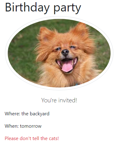
Use the Bootstrap template. Use your own photo. Use Bootstrap classes to make it circular (or oval or whatever BS does). Use only built-in Bootstrap classes; don't make your own.
Submit the URL, as usual.
Up next
If you don't like the BS styles, you can override them. Let's see how.