Not graded. So why do it?
Lesson contents
Log in
If you're a student, please log in, so you can get the most from this page.
Let's talk about common ways of styling a table.
The sitch
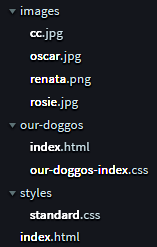
For this lesson, suppose we're making a family website, at https://jones-family.net. Here's the folder structure, part of it, anyway:
Note
Image colors adjusted to improve a11y. You'll learn more later.
The home page is the index.html at the bottom of the image.
Why is the file named index.html?

Adela
Usually, people would go to the site without giving a file name, like https://jones-family.net. When it doesn't have a file name, the server uses a default, like index.html.
Right.
Here's the site again.

It has a folder called our-doggos, with a page named index.html. That page will be about the family's dogs.
A browser could get the file index.html in the our-doggos folder at the URL https://jones-family.net/our-doggos/index.html. What's another URL for the same file?

Georgina
Would it be https://jones-family.net/our-doggos?
Yes, exactly. The index.html-is-the-default thing applies to every folder on the site.
Some more things to notice.

There's an images folder, for images that might be used across the site. There's a styles folder, with standard.css. That has standard styles, that will give all the pages on the site a consistent look.
There's another CSS file in our-doggos. What's that for?

Adela
That's probably for styles that are specific to the index.html in that folder.
Yes, that's it! The page is going to need more styling than standard.css gives.
Styling a table
Suppose we want a table that looks like this:
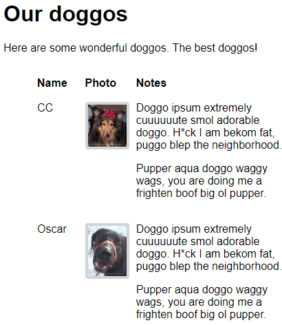
This is going to be a bit tricky, so hang on.
Here are images here, so let's start by adding this:
- img {
- max-width: 100%;
- }
Remember that this makes images work better on phones.
Here's some HTML to make the table:
- <table id="doggos">
- <thead>
- <tr>
- <th>Name</th>
- <th>Photo</th>
- <th>Notes</th>
- </tr>
- </thead>
- <tbody>
- <tr>
- <td>CC</td>
- <td>
- <img src="images/cc.jpg" alt="CC">
- </td>
- <td>
- <p>
- Doggo ipsum extremely cuuuuuute smol
- adorable doggo. H*ck I am bekom fat,
- puggo blep the neighborhood.
- </p>
- <p>
- Pupper aqua doggo waggy wags, you
- are doing me a frighten boof big ol pupper.
- </p>
- </td>
- </tr>
- <tr>
- <td>Oscar</td>
- <td>
- <img src="images/oscar.jpg" alt="Oscar">
- </td>
- <td>
- <p>
- Doggo ipsum extremely cuuuuuute smol
- adorable doggo. H*ck I am bekom fat,
- puggo blep the neighborhood.
- </p>
- <p>
- Pupper aqua doggo waggy wags, you
- are doing me a frighten boof big ol pupper.
- </p>
- </td>
- </tr>
- <tr>
- <td>Renata</td>
- <td>
- <img src="images/renata2.png" alt="Renata">
- </td>
- <td>
- <p>
- Doggo ipsum extremely cuuuuuute smol
- adorable doggo. H*ck I am bekom fat,
- puggo blep the neighborhood.
- </p>
- <p>
- Pupper aqua doggo waggy wags, you
- are doing me a frighten boof big ol pupper.
- </p>
- </td>
- </tr>
- <tr>
- <td>Rosie</td>
- <td>
- <img src="images/rosie.jpg" alt="Rosie">
- </td>
- <td>
- <p>
- Doggo ipsum extremely cuuuuuute smol
- adorable doggo. H*ck I am bekom fat,
- puggo blep the neighborhood.
- </p>
- <p>
- Pupper aqua doggo waggy wags, you
- are doing me a frighten boof big ol pupper.
- </p>
- </td>
- </tr>
- </tbody>
- </table>
The table has an id attribute:
- <table id="doggos">
This will let us apply some special styling.
The table has a head and body, as usual. The body has four rows, each with three columns: name, photo, and notes.
Without styling
Here's what the page looks like, with no styling. It's zoomed way out.
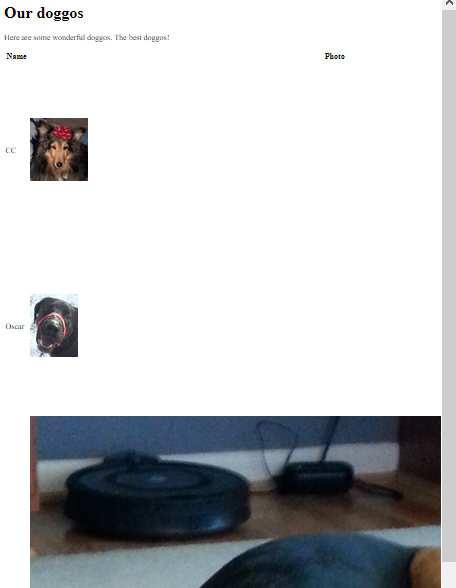
The image for the third row is much bigger than the others. Let's style the images to the same width.
Most tables won't have images in them. For those that do, what image widths we want might be different for each table. Rather than have site-wide standard classes for images in tables, let's put the CSS rules for our doggo images in our-doggos-index.css, the file we're using for CSS just for this page.
Let's add the following:
- table#doggos img {
- width: 97px;
- }
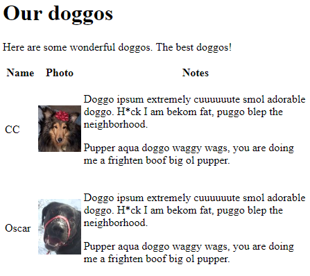
This tells the browser to find a table with an id of doggos, then find the img tags within it. For each of them, set their width to 97 pixels.

Georgina
So...
- selector1 selector2 {
- . . .
- }
... applies to the selector2s inside selector1.
Right. Suppose we had this HTML:
- <p>Giant <span class="cute">sloths</span> are cute!</p>
- <p class="cute">Giant toads, not so much.
We apply this CSS:
- p .cute {
- color: pink;
- }
Which animals would be colored pink? Sloths, toads, or both?

Adela
OK, Tricky McTrickface. I see what you're doing. There's a space in the CSS rule, between the p and the .. The color doesn't get applied to the p with cute, but to elements with cute that are inside a p. The span has cute and is inside a p, so it's the only one that turns pink.
Yes, you got it! Good job, Adela.
Back to doggos. This...
- table#doggos img {
- width: 97px;
- }
... applies to imgs inside a table with an id of doggos. Here's some of the HTML again:
- <table id="doggos">
- . . .
- <td>
- <img src="images/cc.jpg" alt="CC">
- </td>
- . . .
- <td>
- <img src="images/oscar.jpg" alt="Oscar">
- </td>
- . . .
- </table>
These images would be given a width of 97 pixels. Like this:

Ray
In that code:
- table#doggos img {
- width: 97px;
- }
Where did you come up with 97 pixels?

Marcus
I have a guess. It was the width of the smallest image.
That's right! Try not to make an image wider than it is. They can look funny stretched out. So, the widest I could make the images was the lowest width. Any more, and at least one of the images might be stretched out.
Indenting
Let's say we want all of our tables to be indented 2 rem, including the doggos table. We can put that rule in standard.css.
- table {
- margin-left: 2rem;
- }
We get:
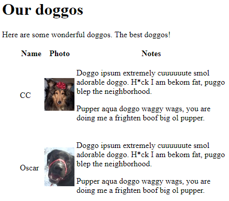
Notice we used margin-left. We can set all four margins individually, or set them all the same, with margin.
In the screenshot, the table cells are centered vertically. So "CC" is centered on the image.
Let's bring cell content to the top. We want:
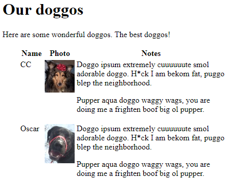
Let's add to standard.css:
- table td {
- vertical-align: top;
- }
middle is the default for td. We change them all to top. We get:
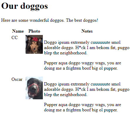

Marcus
Wait, that's not right. The notes aren't at the top.
Hmm, you're right. What's the sitch? Here's the HTML again:
- <tr>
- <td>CC</td>
- <td>
- <img src="images/cc.jpg" alt="CC">
- </td>
- <td>
- <p>
- Doggo ipsum extremely cuuuuuute smol
- adorable doggo. H*ck I am bekom fat,
- puggo blep the neighborhood.
- </p>
- <p>
- Pupper aqua doggo waggy wags, you
- are doing me a frighten boof big ol pupper.
- </p>
- </td>
- </tr>

Georgina
Oh, I see it! Maybe. The first two cells just have stuff in them. The last one has ps. ps put some blank space at the top!
Right!

Marcus
Wow, that's good, G. I never thought of that.
Anything we can do about it?

Adela
Could we set the top margin of those ps to zero? But just the ps inside the table. Don't want to mess up the others.
Let's give it a try.
- table td p {
- margin-top: 0;
- }
Take ps that are inside tds that are inside tables. Set their top margins to zero. Here's what we get.

Cool!
Headings to the left
Here's what we have so far.

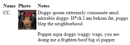
Let's move the headings to the left of their cells. The Name, Photo, and Notes. Right now, they're centered.
Here's the HTML:
- <thead>
- <tr>
- <th>Name</th>
- <th>Photo</th>
- <th>Notes</th>
- </tr>
The CSS:
- table th {
- text-align: left;
- }
The result:
Cell spacing
Let's add a bit of whitespace around each cell:
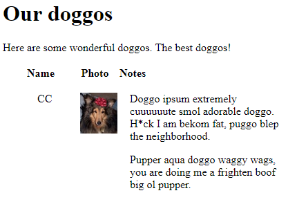
Let's add this:
- table {
- margin-left: 2rem;
- border-spacing: 1rem;
- }
We get:

Cool!
Finish up
Now let's font the body, and add borders to the images.
- body {
- font-family: sans-serif;
- }
- img {
- max-width: 100%;
- border: solid lightgrey 4px;
- border-radius: 4px;
- }
The result:

Yay!
Up next
We've got all the HTML tags we need, and know how to do basic styling. Next, you'll put everything together to make a complete site.